Shewhart Works on Coronavirus

As Covid-19 spreads throughout the world, we need a method to learn from the daily death counts from each geography (countries, states, counties, and cities) and be able to know when we have reached the apex or peak of the “curve”. We are focusing on deaths because currently the number of confirmed cases is a product of the testing strategy in each area). As with all measures, we don’t want to overreact to common cause changes in the number of deaths each day.

Epidemiologists would use a logistic function to model this growth phase of an epidemic, so we should try to approximate that model. Analyzing logarithms of the death count data does this. Our approach is to develop Shewhart charts base on regression of logs of death counts, transformed back to count scale
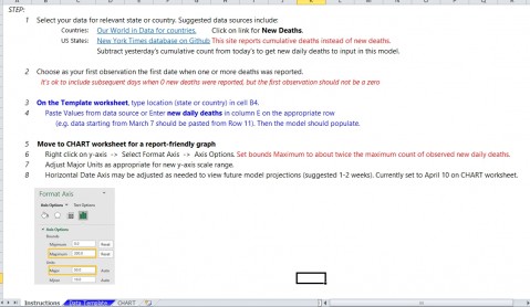
Here are the steps we have used in the TEMPLATE
1. Use daily count data from your geography
Countries: Our World in Data for countries.
US States: New York Times database on GitHub.
Or use local data you have available.

2. Select start data as day when the first death occurs and end with most recent data available. Need at least 8 days with deaths to get a reasonable chart.

3. Transform the counts using log10 function (log of 0 is not defined, so has to be positive numbers)

4. Calculate the intercept and slope (regression analysis) for the log10 data series. Use to calculate a center line for the chart base on the regression line.

5. Develop a Shewhart I chart using the regression center line and the residuals from the CL

6. Transform the Centerline, upper limit, and lower limit back to the count scale (extending to future dates)

7. Plot control chart with original counts and the transformed CL and limits.

8. The chart will approximate the logistic function for the growth period of the death curve.

9. A special cause below the lower limit is an indication that the growth period has ended and this country has reached the peak in the number of deaths.

Here is are two example charts (US through 4/2 and New York through 4/1.


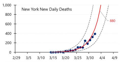
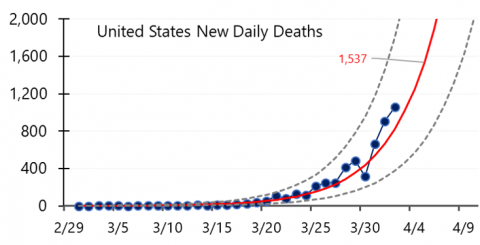
These charts were recently featured in two US News and World Report articles focusing on countries and U.S. states.


Try this out and share the chart with others in your community.

Continue reading
  4260 Hits
  0 Comments
4260 Hits
0 Comments

Variation in Suicide Rates

 National Public Radio’s  “All Things Considered” program on May 7, 2018, discussed the conditions in Puerto Rico since Hurricane Maria, focusing on the emotional detriment of survivors:


“Indeed, the overall suicide rate in Puerto Rico increased 29 percent in 2017 over the previous year, with a significant jump after Hurricane Maria, according to the Puerto Rico Department of Public Health. And that anguish is continuing”.[i]

FiveThirtyEight’s “Significant Digits” newsletter picked up the NPR report on May 9:


“29 percent.  Puerto Rico still has areas contending with terrible living conditions following Hurricane Maria and the lackluster response to the storm from the mainland United States. Even the deadly effects of the storm are far from over: With many still living without power or their lives otherwise disrupted, particularly elderly populations, the overall suicide rate in Puerto Rico increased 27 [sic] percent in 2017 compared to 2016 levels.”[ii]

In the wake of the hurricane, stories about a “significant jump” in suicides tend to resonate with those of us who are sympathetic to the plight of all Puerto Ricans impacted by the disaster and its interminable aftermath. But the seemingly compelling statistic presented – a 29% increase in the overall suicide rate from 2016 to 2017 – misses the point when presented alone. The stories fail to take into consideration historical variation in suicide rates. What insights might we gain from applying Shewhart’s theories and methods to understand variation over time? The 29% increase reported by NPR and FiveThirtyEight is based on historical Puerto Rico Department of Health data on population and the number of suicides reported during 2000—2017.[iii]  I used these same data to create a U-chart, displaying the rate of suicides per 100,000 population:


This chart shows an average rate of 8.2 suicides for every 100,000 residents in twenty-first century Puerto Rico. Seen also are a number of signals of special cause variation in the suicide rate: 

 -       6.8: below the lower control limit in 2002,

-       9.5: two out of three observations near the upper control limit in 2009 and 2010,

-       and 5.8: below the lower control limit in 2016. 

Studying factors impacting the suicide rate during these three time periods could reveal key insights. Conclusions about the 2017 result could be judged relative to their coherence with this history. Note that the 7.6 rate for 2017 is common to the historic system in Puerto Rico. The “29% increase” reported is mostly due to the effect of the unusually low rate in 2016. 

Analyses of single data points are easily abused. Headlines based on single data points are easy to write. Statisticians and other data analysts have a responsibility to produce interpretations that go beyond the single data point. A contribution that NPR could make would be to report on the reduction in the suicide rate that occurred in 2016 and how to maintain that low rate, which likely would be a combination of factors, perhaps one of them being better response to hurricanes.


[i] Varney, Sarah. "Listless And Lonely In Puerto Rico, Some Older Storm Survivors Consider Suicide.” NPR.org. https://n.pr/2Ipcdww (accessed May 9, 2018).

[ii] Hickey, Walt. “Significant Digits for Wednesday, May 9, 2018.” FiveThirtyEight.com. https://fivethirtyeight.com/features/significant-digits-for-wednesday-may-9-2018/ (accessed May 9, 2018).

[iii] Gobierno de Puerto Rico, Departmento de Salud. Estadísticas Preliminares de Casos de Suicidio Puerto Rico. https://bit.ly/2IiQcw5 (accessed May 9, 2018).


Continue reading
  4707 Hits
  0 Comments
4707 Hits
0 Comments

QI in Public Health

From my recent experience at the HRSA/NICHQ Infant Mortality Summits, a meeting of the Collaborative Improvement and Innovation Network (CoIIN) to Reduce Infant Mortality, it seems that the time is ripe for the widespread growth of quality improvement (QI) strategies in the public health arena.

Prior to the Summits in July, public health leaders from 34 states and jurisdictions participating in the CoIIN completed a survey on their previous exposure to QI. In most of the basic QI areas, such as writing an aim statement or creating effective QI measures, more than 75 percent of the state leaders said they had moderate or high exposure to these concepts. That’s a pretty good start.

And, QI is becoming a way of operating for several public health agencies across the country. The South Carolina Department of Health, for example, describes how QI has transcended its initial improvement projects and is now being applied to all of its programs so that services can be delivered more efficiently and effectively. Also telling was the January 2012 issue of the Journal of Public Health Management and Practice, which focused on the public health applications of QI.

To fully benefit from QI, however, state leaders must first understand the roles of quality planning, quality control and quality improvement, known as Juran’s Trilogy. Many current quality activities in state organizations are focused solely on quality control: “the regulatory process through which we measure actual quality performance, compare it with quality goals, and act on the difference” (Juran, 1988). Although these activities are essential to maintaining system performance, QI is required for attaining new and unprecedented levels of performance, like reducing infant mortality rates and closing health equity gaps.

Public health organizations that want to develop their capability to use QI strategically should begin with a study of W. E. Deming’s framework for the science of improvement. This framework encourages the selection and use of QI methods that will be effective in the specific context of interest. In particular, to develop effective QI activities, one must first appreciate the system one is trying to improve. Public health leaders who can describe their organizations and work as processes have set the foundation for improvement.


Are you a public health leader using QI to effect systems change in your community or state? How are you going to build on your initial successes? Share your thoughts via the comments.

Also posted at http://www.nichq.org/blog/2014/november/qi%20in%20public%20health


Continue reading
  6025 Hits
  0 Comments
6025 Hits
0 Comments

Methods for Learning

Interesting posting in NYT Science section today (Feb 3). "Method of Study Is Criticized in Group’s Health Policy Tests"

http://nyti.ms/1biIbzN

The RCT is framed as the only way to learn. What are the best methods to learn about approaches to improving?


Continue reading
  5524 Hits
  0 Comments
5524 Hits
0 Comments