As Covid-19 spreads throughout the world, we need a method to learn from the daily death counts from each geography (countries, states, counties, and cities) and be able to know when we have reached the apex or peak of the “curve”. We are focusing on deaths because currently the number of confirmed cases is a product of the testing strategy in each area). As with all measures, we don’t want to overreact to common cause changes in the number of deaths each day.
Epidemiologists would use a logistic function to model this growth phase of an epidemic, so we should try to approximate that model. Analyzing logarithms of the death count data does this. Our approach is to develop Shewhart charts base on regression of logs of death counts, transformed back to count scale
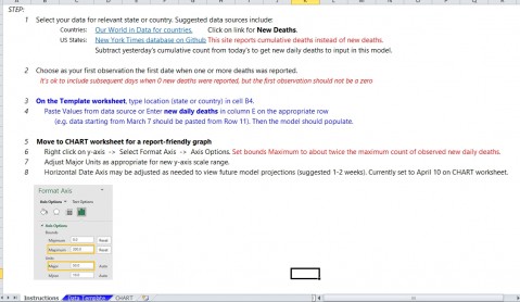
Here are the steps we have used in the TEMPLATE
1. Use daily count data from your geography
Countries: Our World in Data for countries.
US States: New York Times database on GitHub.
Or use local data you have available.
2. Select start data as day when the first death occurs and end with most recent data available. Need at least 8 days with deaths to get a reasonable chart.
3. Transform the counts using log10 function (log of 0 is not defined, so has to be positive numbers)
4. Calculate the intercept and slope (regression analysis) for the log10 data series. Use to calculate a center line for the chart base on the regression line.
5. Develop a Shewhart I chart using the regression center line and the residuals from the CL
6. Transform the Centerline, upper limit, and lower limit back to the count scale (extending to future dates)
7. Plot control chart with original counts and the transformed CL and limits.
8. The chart will approximate the logistic function for the growth period of the death curve.
9. A special cause below the lower limit is an indication that the growth period has ended and this country has reached the peak in the number of deaths.
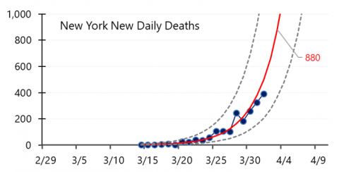
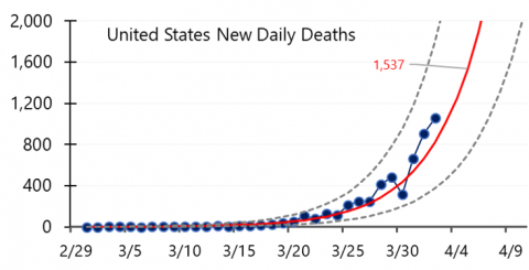
Here is are two example charts (US through 4/2 and New York through 4/1.


These charts were recently featured in two US News and World Report articles focusing on countries and U.S. states.

Try this out and share the chart with others in your community.
