Blog

The API Blog

By accepting you will be accessing a service provided by a third-party external to https://apiweb.org/

Shewhart Works on Coronavirus

As Covid-19 spreads throughout the world, we need a method to learn from the daily death counts from each geography (countries, states, counties, and cities) and be able to know when we have reached the apex or peak of the “curve”. We are focusing on deaths because currently the number of confirmed cases is a product of the testing strategy in each area). As with all measures, we don’t want to overreact to common cause changes in the number of deaths each day.

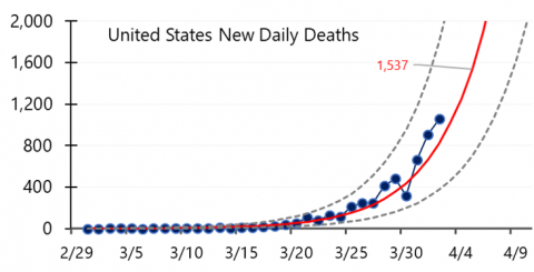
Epidemiologists would use a logistic function to model this growth phase of an epidemic, so we should try to approximate that model. Analyzing logarithms of the death count data does this. Our approach is to develop Shewhart charts base on regression of logs of death counts, transformed back to count scale
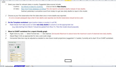
Here are the steps we have used in the TEMPLATE
1. Use daily count data from your geography
Countries: Our World in Data for countries.
US States: New York Times database on GitHub.
Or use local data you have available.

2. Select start data as day when the first death occurs and end with most recent data available. Need at least 8 days with deaths to get a reasonable chart.

3. Transform the counts using log10 function (log of 0 is not defined, so has to be positive numbers)

4. Calculate the intercept and slope (regression analysis) for the log10 data series. Use to calculate a center line for the chart base on the regression line.

5. Develop a Shewhart I chart using the regression center line and the residuals from the CL

6. Transform the Centerline, upper limit, and lower limit back to the count scale (extending to future dates)

7. Plot control chart with original counts and the transformed CL and limits.

8. The chart will approximate the logistic function for the growth period of the death curve.

9. A special cause below the lower limit is an indication that the growth period has ended and this country has reached the peak in the number of deaths.

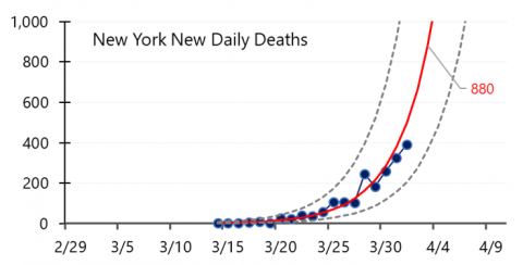
Here is are two example charts (US through 4/2 and New York through 4/1.


These charts were recently featured in two US News and World Report articles focusing on countries and U.S. states.


Try this out and share the chart with others in your community.

Continue reading
  4914 Hits
  0 Comments
4914 Hits
0 Comments

Variation in Suicide Rates

 National Public Radio’s  “All Things Considered” program on May 7, 2018, discussed the conditions in Puerto Rico since Hurricane Maria, focusing on the emotional detriment of survivors:


“Indeed, the overall suicide rate in Puerto Rico increased 29 percent in 2017 over the previous year, with a significant jump after Hurricane Maria, according to the Puerto Rico Department of Public Health. And that anguish is continuing”.[i]

FiveThirtyEight’s “Significant Digits” newsletter picked up the NPR report on May 9:


“29 percent.  Puerto Rico still has areas contending with terrible living conditions following Hurricane Maria and the lackluster response to the storm from the mainland United States. Even the deadly effects of the storm are far from over: With many still living without power or their lives otherwise disrupted, particularly elderly populations, the overall suicide rate in Puerto Rico increased 27 [sic] percent in 2017 compared to 2016 levels.”[ii]

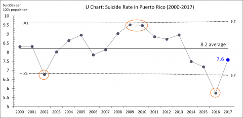
In the wake of the hurricane, stories about a “significant jump” in suicides tend to resonate with those of us who are sympathetic to the plight of all Puerto Ricans impacted by the disaster and its interminable aftermath. But the seemingly compelling statistic presented – a 29% increase in the overall suicide rate from 2016 to 2017 – misses the point when presented alone. The stories fail to take into consideration historical variation in suicide rates. What insights might we gain from applying Shewhart’s theories and methods to understand variation over time? The 29% increase reported by NPR and FiveThirtyEight is based on historical Puerto Rico Department of Health data on population and the number of suicides reported during 2000—2017.[iii]  I used these same data to create a U-chart, displaying the rate of suicides per 100,000 population:


This chart shows an average rate of 8.2 suicides for every 100,000 residents in twenty-first century Puerto Rico. Seen also are a number of signals of special cause variation in the suicide rate: 

 -       6.8: below the lower control limit in 2002,

-       9.5: two out of three observations near the upper control limit in 2009 and 2010,

-       and 5.8: below the lower control limit in 2016. 

Studying factors impacting the suicide rate during these three time periods could reveal key insights. Conclusions about the 2017 result could be judged relative to their coherence with this history. Note that the 7.6 rate for 2017 is common to the historic system in Puerto Rico. The “29% increase” reported is mostly due to the effect of the unusually low rate in 2016. 

Analyses of single data points are easily abused. Headlines based on single data points are easy to write. Statisticians and other data analysts have a responsibility to produce interpretations that go beyond the single data point. A contribution that NPR could make would be to report on the reduction in the suicide rate that occurred in 2016 and how to maintain that low rate, which likely would be a combination of factors, perhaps one of them being better response to hurricanes.


[i] Varney, Sarah. "Listless And Lonely In Puerto Rico, Some Older Storm Survivors Consider Suicide.” NPR.org. https://n.pr/2Ipcdww (accessed May 9, 2018).

[ii] Hickey, Walt. “Significant Digits for Wednesday, May 9, 2018.” FiveThirtyEight.com. https://fivethirtyeight.com/features/significant-digits-for-wednesday-may-9-2018/ (accessed May 9, 2018).

[iii] Gobierno de Puerto Rico, Departmento de Salud. Estadísticas Preliminares de Casos de Suicidio Puerto Rico. https://bit.ly/2IiQcw5 (accessed May 9, 2018).


Continue reading
  5305 Hits
  0 Comments
5305 Hits
0 Comments

New York Times Berwick Op Ed - April 2, 2017

Don discussed why the ACA will persist despite attempts to repeal.

https://www.nytimes.com/2017/04/01/opinion/sunday/obamacare-can-survive-trump.html?_r=0


Continue reading
  5147 Hits
  0 Comments
5147 Hits
0 Comments

Part 1: Complexity of the Real World Has Outpaced the Myth of the Linear Method

Dr. Russel Ackoff spoke often of how we were prepared to deal with the real world in school. We were usually presented with a “case study.” We would then busy ourselves in reading and developing ideas around the case study. We would then turn in or present the case to the teacher for a grade. Ackoff noted that in the real world, problems do not come in the form a case study, but as a “mess.” Part of our journey is understanding the mess and developing a statement of the challenge.  Laurence J. Peter warns us in the quote:

“Some problems are so complex that you have to be highly intelligent and well informed just to be undecided about them.”

The challenge before most of us trying to make improvements is the complexity of environment in which we are working. Systems that are not closed but open systems that are dynamic accompanied by influences for which we may or may not be aware. Ramo (2016) draws the distinction between complicated and complex systems:

Complicated mechanisms can be designed, predicted, and controlled. Jet engines, artificial hearts, and your calculator are complicated in this sense. They may contain billions of interacting parts, but they can be laid out and repeatedly, predictably made and used. They don’t change. Complex systems, by contrast, can’t be so precisely engineered. They are hard to fully control. Human immunology is complex in this sense. The World Wide Web is complex.

Complicated systems have the property of being closed systems, while complex systems operate in an open environment that is very dynamic. Many of us working to make improvements in our organizations can relate readily to the idea of complex system. Into this fray, many of us are given problem solving methods that are linear. We are presented with the idea that if we follow the method, we will be led to a solution. Dr. Jeff Conklin presented some research around the so-called “Waterfall” method commonly used to develop software. Figure 1 describes this method:

Figure 1: Waterfall Method of Problem Solving


In this method, we are to gather data, analyze the data, formulate a solution and implement the solution. How does the real world react to this linear path? Conklin then presented the experience of one designer following the method. Figure 2 describes how the perception of the designer vacillates from problem to solution over the course of using this method:

Figure 2: Waterfall Method with One Designer


Conklin referred to this vacillation as a “wicked journey.” If you have worked on an improvement effort of any complexity you can appreciate this journey. One day filled with hope and a solution, the next day, frustrated by an unintended consequence of your change, you are now faced with the challenge to adapt to the new circumstances you are facing. More work to do!

Life would be good if we could handle complex challenges by ourselves (the lone designer) as in Figure 2. Complex challenges usually require subject matter knowledge of other people. What happens as we add other people? Do they share our perceptions of the problem and solution? Figure 3 describes the journey with two designers:

Figure 3: Waterfall Method with Two Designers


From Figure 3, we can readily see the perceptions between the two designers track at times and are very different at other times. For improvement teams, we usually have 3-5 people on a team. Conklin refers to this addition of people as “social complexity.” Personality intelligence tells us that people are very different. Their perceptions of the same events, data, etc. may be very different given how they learn and their subject matter knowledge.

We had an improvement team in an international tech company that used a method called Understanding, Develop Changes, Test Changes and Implement Changes (UDTI). Within each of the defined phases the Plan-Do-Study-Act (PDSA) cycles were utilized. The team referred to their journey as “wicked.” Figure 4 describes this team’s journey:

Figure 4: Using UDTI with PDSA Cycles to Make an Improvement


In following the PDSA cycles in the figure, you can imagine the frustration of the team in PDSA 12 when a rush to implementation led to failure and required a visit back to the “Understand” phase. After this learning, testing was always done before implementation. The six cycles of implementation at the end were the spread of known changes to other regional groups.

What is the downside of the vacillation between the stages of the linear method? When an improvement team discovers an unintended consequence of a test, they must go back to a prior stage of the linear model, many see this as a failure.  Experienced people with improvement efforts understand that when addressing complex challenges, learning and unlearning are natural parts of the journey. However, the same organization that used the UDTI method had one team in Europe that eliminated all the failed PDSA cycles of the improvement journey, forcing a perfect match to the method. Unfortunately, this sort of practice, while helping self-esteem has nothing to do with the science of improvement.

People who use such linear methods often discuss the vacillation of the hopeful path. One of my colleagues is looking for the first project of any complexity that follows such a method. So far, we have not found one. Margaret Wheatley once commented on why the myth of success with linear methods continues: “After the fact, people usually report their journey by the prescribed method, thereby reinforcing their use.” Dr. Jeff Conklin and the UDTI team have given us some insight into use of such methods as they encounter a world of complexity. Hopefully, we won’t be surprised when the real world does not cooperate.

In Part 2, we will examine some methods based on the science of improvement. The importance of questions in addressing complex systems and help in addressing the social consequences of technical change.


References:

1.       Conklin, Jeff, Wicked Problems and Social Complexity (2008); This paper is Chapter 1 of Dialogue Mapping: Building Shared Understanding of Wicked Problems, by Jeff Conklin, Ph.D., Wiley, October 2005. For more information see the CogNexus Institute website http://www.cognexus.org. © 2001-2008 CogNexus Institute. Rev. Oct 2008.

2.       Ramo, Joshua Cooper. The Seventh Sense: Power, Fortune, and Survival in the Age of Networks (p. 137). Little, Brown and Company.

3.       Leadership and the New Science, Margaret Wheatley, Berrett Koehler Publishers, San Francisco, 1992. Note: In searching this book, we were not able to locate the quote from Wheatley. In communication with her staff, we were told to attribute. The reader may find this reference useful. Find Part 2 here


Continue reading
  5425 Hits
  0 Comments
5425 Hits
0 Comments

Time to Retire the 16th Century Root Cause Phrase and Thinking  

Systems thinking has destroyed the idea of single cause thinking from the 16th century. Systems thinking has been on a roll since Bertalanffy wrote General Systems Theory in 1968. In spite of systems thinking, the use of "root cause" phrase persists.

Psychologically, there is an upside and downside of the phrase “Root Cause Analysis (RCA).” The upside, the illusion of single cause thinking gives people hope. It sends the message that one thing is going on and they can handle that. On the downside, the mental image of a “root cause,” leads people to finding a cause. I once watched in horror as a Master Black Belt (MBB) led a group of engineers in a high-tech company through a multi-voting exercise on an Ishikawa Diagram. Once the MBB had all the votes, they focused on the “top cause.” There was a short plan put together to investigate this single "cause."  Since I was visiting, I was silent until someone asked me what I thought. I asked a question about the possible covariance of factors for the application being discussed. After one engineer that the factors do indeed interact, they got back to reality. Rather than one factor, they needed to consider multiple factors in a designed experiment.

There is hope. People are waking up! In 2015, The National Patient Safety Foundation exposed many of the problems with the myth of "Root Cause Analysis:" From the report:

"RCA itself is problematic and does not describe the activity’s intended purpose. First, the term implies that there is one root cause, which is counter to the fact that health care is complex and that there are generally many contributing factors that must be considered in understanding why an event occurred. In light of this complexity, there is seldom one magic bullet that will address the various hazards and systems vulnerabilities, which means that there generally needs to be more than one corrective action. Second, the term RCA only identifies its purpose as analysis, which is clearly not its only or principal objective, as evidenced by existing regulatory requirements for what an RCA is to accomplish. The ultimate purpose of an RCA is to identify hazards and systems vulnerabilities so that action scan be taken that improve patient safety by preventing future harm.

The term RCA also seems to violate the Chinese proverb “The beginning of wisdom is to call things by their right names,” and this may itself be part of the underlying reason why the effectiveness of RCAs is so variable. While it might be better not to use the term RCA, it is so imbedded in the patient safety culture that completely renaming the process could cause confusion."


The last line is tragic, unlearning is usually the first step in learning for many (some try to avoid it at all costs). From this line, the authors are in effect protecting people from learning. Cognitive Dissonance is a natural part of how we learn, adapt and change. The paper on RCA2 can be found here: 


http://c.ymcdn.com/sites/www.npsf.org/resource/resmgr/PDF/RCA2_v2-online-pub_010816.pdf

The effort to restore systems thinking and 21st century science continued in February, 2017 with publication by Kiran Gupta, MD, MPH, and Audrey Lyndon, PhD, entitled Rethinking Root Cause Analysis. This paper has some great tables that describe the various problems associated with RCA. The authors are working with reference to 2015 paper referenced before. Their paper can be found here:

https://psnet.ahrq.gov/perspectives/perspective/216

References:


Continue reading
  5440 Hits
  0 Comments
5440 Hits
0 Comments

Understanding Variation - Request for Examples and Discussion

Provide examples and discussion for applying Shewhart's and Deming's ideas for understanding variation as described in the article:

 http://www.apiweb.org/images/PDFs/understanding-variation26-years-later.pdf


Continue reading
  6133 Hits
  0 Comments
6133 Hits
0 Comments

QI in Public Health

From my recent experience at the HRSA/NICHQ Infant Mortality Summits, a meeting of the Collaborative Improvement and Innovation Network (CoIIN) to Reduce Infant Mortality, it seems that the time is ripe for the widespread growth of quality improvement (QI) strategies in the public health arena.

Prior to the Summits in July, public health leaders from 34 states and jurisdictions participating in the CoIIN completed a survey on their previous exposure to QI. In most of the basic QI areas, such as writing an aim statement or creating effective QI measures, more than 75 percent of the state leaders said they had moderate or high exposure to these concepts. That’s a pretty good start.

And, QI is becoming a way of operating for several public health agencies across the country. The South Carolina Department of Health, for example, describes how QI has transcended its initial improvement projects and is now being applied to all of its programs so that services can be delivered more efficiently and effectively. Also telling was the January 2012 issue of the Journal of Public Health Management and Practice, which focused on the public health applications of QI.

To fully benefit from QI, however, state leaders must first understand the roles of quality planning, quality control and quality improvement, known as Juran’s Trilogy. Many current quality activities in state organizations are focused solely on quality control: “the regulatory process through which we measure actual quality performance, compare it with quality goals, and act on the difference” (Juran, 1988). Although these activities are essential to maintaining system performance, QI is required for attaining new and unprecedented levels of performance, like reducing infant mortality rates and closing health equity gaps.

Public health organizations that want to develop their capability to use QI strategically should begin with a study of W. E. Deming’s framework for the science of improvement. This framework encourages the selection and use of QI methods that will be effective in the specific context of interest. In particular, to develop effective QI activities, one must first appreciate the system one is trying to improve. Public health leaders who can describe their organizations and work as processes have set the foundation for improvement.


Are you a public health leader using QI to effect systems change in your community or state? How are you going to build on your initial successes? Share your thoughts via the comments.

Also posted at http://www.nichq.org/blog/2014/november/qi%20in%20public%20health


Continue reading
  6647 Hits
  0 Comments
6647 Hits
0 Comments

Six Scaling Mantras

Six Scaling Mantras

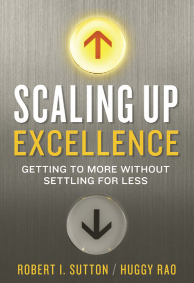
Bob Sutton of Stanford University is first rate thinker and author. One of my favorite books by Bob is Hard Facts, Half Truths and Total Nonsense. Well worth a read. Recently, Bob and his co-author have turned their talents to scaling up change. The new book is called, Scaling Up Excellence - Getting to More Without Settling for Less. In the very first part of the book, Bob details Six Mantras of Scale Up:


  1. Spread a mindset, not just a footprint. Running up the numbers and putting your logo on as many people and places as possible isn’t enough.
  2. Engage all the senses. Bolster the mindset you want to spread with supportive sights, sounds, smells, and other subtle cues that people may barely notice, if at all.
  3. Link short-term realities to long-term dreams. Hound yourself and others with questions about what it takes to link the never-ending now to the sweet dreams you hope to realize later.
  4. Accelerate accountability. Build in the feeling that “I own the place and the place owns me.”
  5. Fear the clusterfug. The terrible trio of illusion, impatience, and incompetence are ever-present risks. Healthy doses of worry and self-doubt are antidotes to these three hallmarks of scaling clusterfugs.
  6. Scaling requires both addition and subtraction. The problem of more is also a problem of less.

I found #5 to be very descriptive of some famous failures in business. Sutton and Rao go into more detail on the “trio” of illusion, impatience, and incompetence: 

  • Illusion: Decision makers believe that what they are scaling up is far better and easier to spread than the facts warrant.

  • Impatience: Decision makers believe that what they are scaling is so good and easy to spread that they rush to roll it out before it is ready, they are ready, and the organization is ready.

  • Incompetence: Decision makers lack the requisite knowledge and skill about what they are spreading and how to spread it,


    If you have not read Sutton before, I think you will find the read informative and entertaining. A great combination.


    Reference: Sutton, Robert I.; Rao, Huggy (2014-02-04). Scaling Up Excellence: Getting to More Without Settling for Less (p. 25). Crown Publishing Group. Kindle Edition.


Continue reading
  8051 Hits
  0 Comments
8051 Hits
0 Comments

Design of services

Recently the members of API were discussing the difference we have observed between the design of services and the design of products. For products the product itself is visible and tangible to the customer but not the manufacturing system that made the product. We purchase and use a smart phone but have little or no knowledge of where and how it was made. Services are different. The service itself and the system to deliver the service are often tightly linked and observable by the customer, especially in professional services such as health care. One goes to a doctor's office to get treatment. The treatment is the service that is needed.  The visit to the doctor's office is the means by which the service is delivered. 

This link between service and delivery system can slow down innovation and improvement by distracting from the underlying need of the customer. The customer may have a need for medical treatment but the doctor's office is only one way of  delivering the treatment. One method to over come this obstacle is to use a 5x (1, 5, 25, 125, 625, ...) scale up approach when designing or  redesigning services. Develop ideas for a service and establish one or more prototypes. Test the prototype with 1 then 5 then 25 potential customers. The aim is to learn how well the service satisfies the need of the customers. If the 25  customers are chosen wisely, a lot can be learned for design and redesign of the service without undue constraint from the delivery system. As the scale is increased by 5x jumps, 125, 625 ... the issues associated with the delivery system come in to play. This approach allows the customer need to drive the design of the service as opposed to the constraints of the delivery system driving the service design. The delivery system design is then in support of the service which is aimed at the need of the customer. 


Continue reading
  6539 Hits
  0 Comments
6539 Hits
0 Comments

Getting to Scale: Can all of the neediest patients receive better care


I wrote in my February posting that the constraint to widespread use of New Rices for Africa was mainly one of overcoming the structural issues of access to seed, fertilizer and small-scale irrigation since farmers were very willing to adopt their use. In this post, I would like to explore these concepts around “getting to scale” a bit further using an example reported by Atul Gawande in the January 24, 2011 edition of the New Yorker. In the article, titled Hot Spotters, Dr. Gawande started with the question - Can we lower medical costs by giving the neediest patients better care? He wrote about the efforts of Dr. Jeffrey Brenner. Dr. Brenner is dedicated to developing a system of intensive outpatient care for complex high-need patients in Camden, NJ. He started his work by identifying and caring for one individual. If 1% of the 75,000 people living in Camden are considered “the neediest”, then Dr. Brenner’s system would have  to include about 750 individuals. In contrast to achieving widespread use of New Rices for Africa, Dr. Brenner faced issues of both identifying and activating individuals and of developing the structures to support a system to care for them.  

Dr. Gawande wrote of the skepticism Dr. Brenner faced in the community as his work unfolded. One woman, when hearing of the added attention she would receive from a social worker, asked “is she going to be all up in my business.” He enlisted the backing of a pastor with the Camden Bible Tabernacle and local community members to share stories about the large amount of money spent locally on health care. The message was that these dollars could be saved with the support planned by Dr. Brenner and better spent elsewhere in the community. Dr. Brenner also listened to the day-to-day issues people faced such as doctors who wouldn’t give appointments to individuals on Medicaid or some not knowing a clinic’s twenty-four hour call number. He worked within the community to overcome these issues. Once individuals began to make the decision to be part of Dr. Brenner’s program, he had to develop the structures needed to care for them. Sufficient staff, beyond volunteers, such as nurse practitioners to make home visits and social workers to serve as health coaches was needed. Information technology to gather referrals and track patients as the system grew had to be developed and sustainable sources of funding beyond small grants had to be found. Dr. Gawande wrote that Dr. Brenner’s Camden Coalition measured the impact on their first thirty-six patients. The results were impressive so Dr. Brenner continues his efforts to activate individuals in the community and to build structures to support their care as he works towards reaching the 750 neediest in Camden.  

Many health care organizations and community coalitions believe they can lower medical costs by giving the neediest patients better care. To realize this, they will need to take a testing and learning mindset and use good methods for influencing individuals to adopt changes and for building effective systems at scale. In this regard, there is a lot to learn from Jeffrey Brenner.


Continue reading
  6685 Hits
  0 Comments
6685 Hits
0 Comments

Webinar summary

For several years I have wondered what it would be like to have a local, state, or federal government run with principles and methods from quality improvement. Until now I had no way to know whether improvement principles could be as effective in governing as they have been in the private sector. What has changed is that a good friend and longtime colleague of mine, Don Berwick, is running for governor of Massachusetts. Don is a pediatrician and former CEO of the Institute for Healthcare Improvement. He is also a master leader of improvement.

In a recent TV interview in Boston the interviewer asked him what differentiated him from the other candidates. He replied:

“What I bring to the table, what excites me, why I want to be governor is thirty years’ experience on innovation and improvement. … How you get things to improve. How you bring innovations to scale. That is my forte.”

To help Don refine this concept API organized a webinar featuring Don to which we invited colleagues and friends who were knowledgeable of improvement. The webinar had two purposes: investigate how improvement methods can be adapted to governing a state and to generate financial support for Don’s campaign. The webinar was free.  We used chat features (online comments from participants) to get input from attendees on some of the initiatives that are emerging as Don’s priorities for his administration and how improvement methods could be used to make progress on them. We covered three topics: Using measures to communicate goals, spreading good ideas from one part of the state to another, and using the Model for Improvement to test ideas and solutions.

MEASUREMENT

System level measurement to communicate what we are trying to accomplish and to provide feedback for learning is fundamental to improvement. Few on the call would be satisfied with an improvement initiative that did not contain key outcome measures plotted over time. Shouldn’t we require the same of our public officials and public initiatives? We discussed some measures related to the issues described on the campaign website. For example, total prison population and number of repeat offenders were proposed as measures of success for the Corrections initiative. A time series of the unemployment rate for Massachusetts from 2006-2013 was discussed. The state data was further divided to display the identical time series for eight regions comprising the entire state. Time series graphs of this type would be common in the private sector.

The chat box  contained some insights on considerations in the public sector if graphs such as these were to be used effectively. Don was encouraged to test out some measures displayed over time in some of the small meetings he is holding with constituents. This could be a very informative test of a basic improvement method. One participant suggested that a debate could be structured around a set of measures displayed over time. Each of the debaters could talk about their ideas in the context of the facts and the current situation.They could be prompted by the moderator to predict how long their ideas would take to change the measure for the better. Some recalled that Ross Perot used charts effectively in debates and speeches. Several of the commenters encouraged the use of stories to complement the measures and connect emmotionally with people.

Recognizing that many of the measures that we were discussing were already publicly available, it was suggested that a third party could set up the set of measures and post them on the web to infuse this thinking into campaigns and governing. Don suggested that in Massachusetts this might be done by the Massachetts Budget and Policy Center http://www.massbudget.org/


SPREAD

Methods for spread of improvements and rapid scale up of promising prototypes are at the leading edge of improvement science. Don told the group that he had encountered numerous ideas or working solutions in one part of the state that could be spread to other locations. One he mentioned was the development of the Assembly Square neighborhood in the city of Sommerville as an example of smart growth that creates jobs. He stated that an adapted approach could work in other parts of the state.

(http://www.bostonglobe.com/opinion/2014/01/18/somerville-little-city-that-could/Oa7nklkmzYp3PPjArSCRCP/story.html)

The use of collaborative projects consisting of multiple organizations working cooperatively on a common aim was developed and popularized as a method for spreading evidence based practices in health care by Don and colleagues at IHI and API. He pointed out that he has already committed on his campaign website to using this approach in state government: “And I will personally help lead a collaborative project among willing communities in the Commonwealth to construct world-class supports to every child under five.”

The concept of spread is found in other areas of the website: “Massachusetts’ charter schools have demonstrated achievements that can serve as laboratories whose results inform mainstream public education." “Our 15 Massachusetts community colleges are especially important in aligning education and workforce needs. The potential for strong public-private partnerships for community colleges is enormous, and we already have some fine prototypes in the state, and they should be available to all.”


MODEL for IMPROVEMENT

The Model for Improvement was developed by API to serve clients in a variety of industries and sectors. It is composed of three questions about aims, measures, and changes that set up the learning and the Plan Do Study Act, PDSA, cycle to test changes. We discussed how the model might be used in governing a state.

What are we trying to accomplish? Clear goals that articulate the priorities for the administration.

How will we know a change is an improvement? Transparently displaying set of measures that allows citizens to judge the progress being made.

What changes can we make that will result in improvement? Good ideas for accomplishing the goals that can come from any location or political persuasion.

Testing and learning: Learn which of these ideas should be adopted, adapted, or scrapped through testing first on a small scale and then spreading the ones that work to other locations.

Attract individuals and organizations in any political or economic sector to work to accomplish the goals.

There was some agreement that the model would be as appropriate for internal state government processes as it is for organizations in other sectors. However, participants noted that more public improvement efforts would face some obstacles not present or at least not as formidible in other sectors. The chat contained some comments on how to define improvement for a general audience: "Improvement is changes that make things better for residents of the state." Provide examples from daily life that are easy to relate to such as more reliable trains, easier renewal of driver's licenses, or more  timely snow removal.

The concept of testing and learning would be different than the prevailing approach of a candidate instilling confidence by assertively giving the solution to any issue or problem.  For example, failed tests might be equated by the media or political rivals as failed policy or ineptitude, rather that opportunities to experiment and learn. One participant recalled that Obama in his first acceptance speech said that there would be mistakes and they would learn ... he was not sure that people remembered or built on that. Many participants expressed belief in the need for an improvement framework in government with proper adaptation to the political environment. Don is in a unique position to make these adaptations because of his knowledge and experience with improvement. Several participants suggested that an agency within the state government could be assigned responsibility for resourcing, educating, measuring and coaching for improvement in the priorty areas.

After the webinar I received personal communication from some participants with some thoughtful comments. One participant wrote the following.  "I was surprised there was no mention of "debt" or fiscal responsibility.  One of the first thoughts that crossed my mind was anything can be improved with enough money.  What might be helpful for Don would be to show how improvement often reduces total costs and how one doesn't necessarily need more money to fund improvement." Regarding cost reduction, the same participant wrote: "Yes, I believe productivity combined with design and outcome thinking could be useful.  However, the idea of productivity solely focused on reducing waste does not resonate with me.  I recall "reducing waste" being connected with productivity during the meeting.  Doing more with less sounds better than doing the same with less although both represent improved productivity."

Two participants had some strong views on communication.  "I agree that Don needs an overall rally cry: e.g.  PEOPLE---PROCESS--PROGRESS.  ...start with empathy...what are people feeling.  Apply Don's special talents in leadership for improvement (process for improvement); results in real progress as measured by the model. My guess is there is a far more powerful theme for Don...just a quick thought. The other suggested: "My political gut says Don could craft his message into pragmatic everyday language, speaking WITH his fellow residents of Massachusetts and decrying that Massachusetts deserves better and then repeatedly describe how the state must make changes that are supported by data that is fully available to all at any time at www..."

Another participant provided some useful advice about how improvement must be imbedded in the right context to be effective. This is the job of leadership - the governor and his or her staff. The following is an excerpt from an article she had written. "Stretch goals have been a topic for disagreement among people interested in improvement.  Some argue that stretch goals are a good thing in that they help people understand that business as usual will not be sufficient and something extraordinary must be done to solve a problem, achieve an improvement, or stay in business.  Others argue that stretch goals are damaging in that they may introduce fear, they may be seen as outrageous and introduce cynicism, and they may introduce gaming, competition and conflict into an organization.  Perhaps the two sides have been talking about two different worlds". (Cultures and contexts)

NEXT STEPS

This summary has been posted on the public API website and I hope that other insights will be put into the comments section. Don was very thankful for the time and insights the participants gave to him. He is considering which ideas from the webinar could be tested in the short term in his campaign. We plan to have another webinar in future as new developments emerge.


Continue reading
  4740 Hits
  0 Comments
4740 Hits
0 Comments

Spread and Scale-up: Different sides of the same aim


I recently came across a 2007 article I had saved from the New York Times. In the article titled, Africa, Prosperity from Seed Falls Short, Celia Dugger wrote about the merits of the New Rices for Africa, or Nericas. ”The seeds are a marvel producing bountiful, aromatic rice crops resistant to drought, pests and disease.” She continued however to describe a situation many improvers face “But a decade after their introduction, the seeds have spread to only a tiny fraction of the land here in West Africa where they could help millions of farming families escape poverty.” We often think reaching everyone who would benefit from an intervention or service is a matter of getting individuals to make the decision to adopt the change. Quite the contrary in West Africa, there “you have farmers who are very willing adopters of new technologies and want to raise yields.” To help diagnosis the problem, it is important to understand that to achieve improved performance at scale you need to consider methods for both spread and scale-up. Spread is focused on methods to increase the rate individuals adopt changes. Scale-up is focused on methods to identify and overcome the structural issues that arise as changes are adopted. When it comes to use of new rices, it is not a spread problem. “Villagers enviously spotted the new rices growing in a neighboring community’s field”. That was enough for them to make the adoption decision. The problem in West Africa is one of scale-up. Ms. Duggar wrote “getting access to seed, fertilizer and small-scale irrigation… is the holy grail of agriculture development” and so overcoming these structural issues is the constraint to wide use of new rices. Most improvers will need to spread and scale-up interventions to achieve their aims so, in future postings, more on the methods to do that and the connection to testing and implementation.


Continue reading
  6301 Hits
  0 Comments
6301 Hits
0 Comments

Methods for Learning

Interesting posting in NYT Science section today (Feb 3). "Method of Study Is Criticized in Group’s Health Policy Tests"

http://nyti.ms/1biIbzN

The RCT is framed as the only way to learn. What are the best methods to learn about approaches to improving?


Continue reading
  6072 Hits
  0 Comments
6072 Hits
0 Comments

Update on Don Berwick webinar.

Summary will be posted by February 14. See www.berwickforgovernor.com

Continue reading
  6047 Hits
  1 Comment
6047 Hits
1 Comment

Analyze Data by Provider Using Control Chart

Many organizations are involved in improvement activities aimed at cancer screening. There are known good ideas to improve screening percentages (use of CIS reminders, huddles, max-packing, etc.). However, there is another source of ideas for improvement that may already be in the organization, but hidden.

Consider these data for breast cancer screening for 60 providers in an organization:


Provider Percent
Screened
Provider Percent
Screened
Provider Percent
Screened
Provider1 58.1 Provider21 53.3 Provider41 55.0
Provider2 42.5 Provider22 50.0 Provider42 54.5
Provider3 28.0 Provider23 34.5 Provider43 30.6
Provider4 41.9 Provider24 74.9 Provider44 42.9
Provider5 32.3 Provider25 45.2 Provider45 24.3
Provider6 57.6 Provider26 43.7 Provider46 53.6
Provider7 64.5 Provider27 50.0 Provider47 41.7
Provider8 37.3 Provider28 25.8 Provider48 100.0
Provider9 41.7 Provider29 55.4 Provider49 42.9
Provider10 61.0 Provider30 0.0 Provider50 43.3
Provider11 50.0 Provider31 62.1 Provider51 48.6
Provider12 77.3 Provider32 43.2 Provider52 36.8
Provider13 48.6 Provider33 43.8 Provider53 30.0
Provider14 56.0 Provider34 42.4 Provider54 46.6
Provider15 32.4 Provider35 58.2 Provider55 51.1
Provider16 51.0 Provider36 40.0 Provider56 29.2
Provider17 43.0 Provider37 54.3 Provider57 36.4
Provider18 54.4 Provider38 41.8 Provider58 43.4
Provider19 38.4 Provider39 43.1 Provider59 45.3
Provider20 63.0 Provider40 50.0 Provider60 45.9

Of course, the data vary. But is there variation is these data that might be useful for guiding improvement efforts? When one thinks about variation within the concepts from Shewhart about common causes of variation and assignable causes of variation, and apply that kind of thinking to our provider data, the following questions arise:

Are all the providers part of the same system? Are some of the providers outside the system? If so, what is different about the way screening is done with the providers who are outside the system.

How can we answer those questions? Shewhart gave us the operational definition of "outside the system" with the control chart methodology that he developed.

A run chart alone does not tell us who is in the system and who is outside (see first figure)

By using P-chart calculations, control limits can be calculated (this requires the raw data of count of patients who are up-to-date with their screening and the total number of patients eligible for screening within the providers panel). The figure below shows a control chart for these data.

Note that there are several provider outside the system (outside of the control limits). Note that the provider with the highest percent of patients screened is inside the system (100%). To help see these differences, we can highlight the data points that indicate a provider who is outside the system (see the figure below);

Red dots show the providers who are outside the system high and blue dot show the providers who are outside the system low.

What can you do with this analysis? Find out why these 7 providers are outside the system. What are they (their care teams) doing differently? The answers to this question will often result in effective ideas for changing the system.

The method described above for looking at variation among providers needs a cautionary note here at the end. These data are a snapshot in time. To look at variation among providers over time, the best tool that I have found is small multiples. Look for another posting on analyzing variation among providers over time where I will post some examples of small multiples.


Even Better Way to View to View Data by Provider (added May 18, 2017)

The funnel plot is a method takes advantage of the idea that the data being analyzed do not have a time order. So, when there is not an inherent order for a set of data, the investigator can order the data in a way that makes it easier to see who is in the system and who is out.

Below is a Shewhart chart of breast cancer screening percentages for 144 providers in a large health system. They are ordered by the size of each provider's panel of women who should be screened for breast cancer, based on age. The providers with the largest panel are on the right-most end of the horizontal axis and those with the smallest panels are at the left-most end of the horizontal axis. Note that most of the providers are "inside the system", meaning that their percentages fall within the Shewhart upper and lower limits. However, there are clearly some of the providers are outside the system high and some of the providers outside the system low.

Adding color-coded circles makes it clear which providers we should talk to about why they are outside the system high (blue in chart below). Knowledge about how to do a better job of screening could be learned from this group of providers and then tested and adapted for the rest of the providers.

Knowledge about why the providers in the red circles are not able to screen at the "system" rate would likely also prove very useful for improving screening rate.

Continue reading
  7350 Hits
  1 Comment
7350 Hits
1 Comment